Comparing Market Sentiment - Twitter vs the "Professionals"

If you’ve been following me for more than a few months, you probably know that I’m researching Twitter Sentiment related to the market for my doctoral dissertation.
A few previous posts on the topic:
- Using Twitter Sentiment for predicting stock price movement
- Will Twitter make you a better investor?
- Understanding Twitter Sentiment for Investing Decisions
Last week, I published a quick update via a photo on twitpic to show a few friends and received quite a lot of feedback and response on that chart.
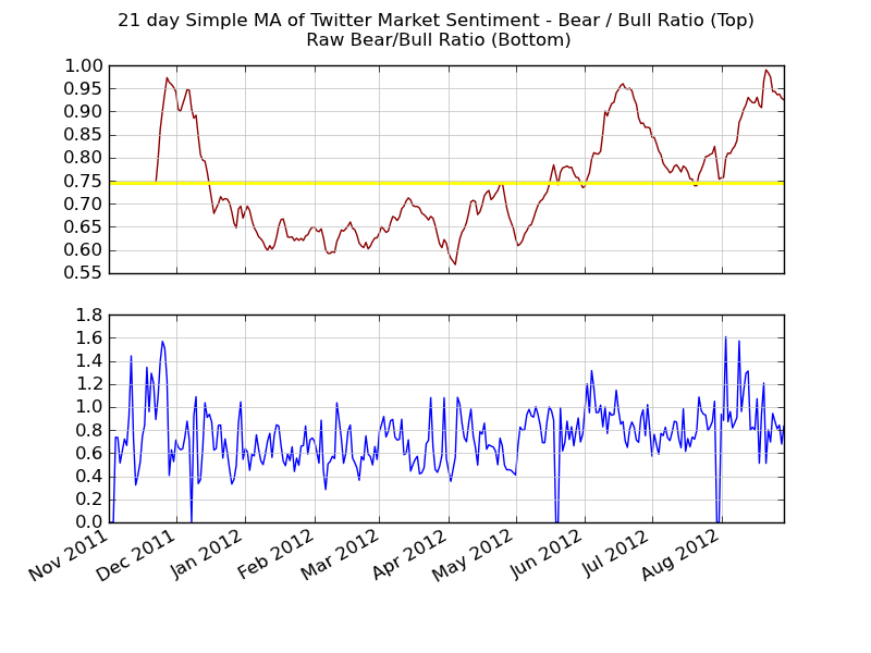
The chart that I shared was a chart of the 21 day moving average of the Bear / Bull Ratio of twitter sentiment..a revised version (current with data up to and including August 28 2012) is below. In the graphs below, the higher the number, the more ‘bearish’ the sentiment…the lower the number, the more ‘bullish’ the sentiment.
The top graph is the 21 day moving average of the Bear / Bull Sentiment Ratio with the average ratio shown as a yellow horizontal line. The bottom graph is the raw Bear/Bull Sentiment Ratio…you can see that it is rather noisy, hence the moving average to smooth it out.
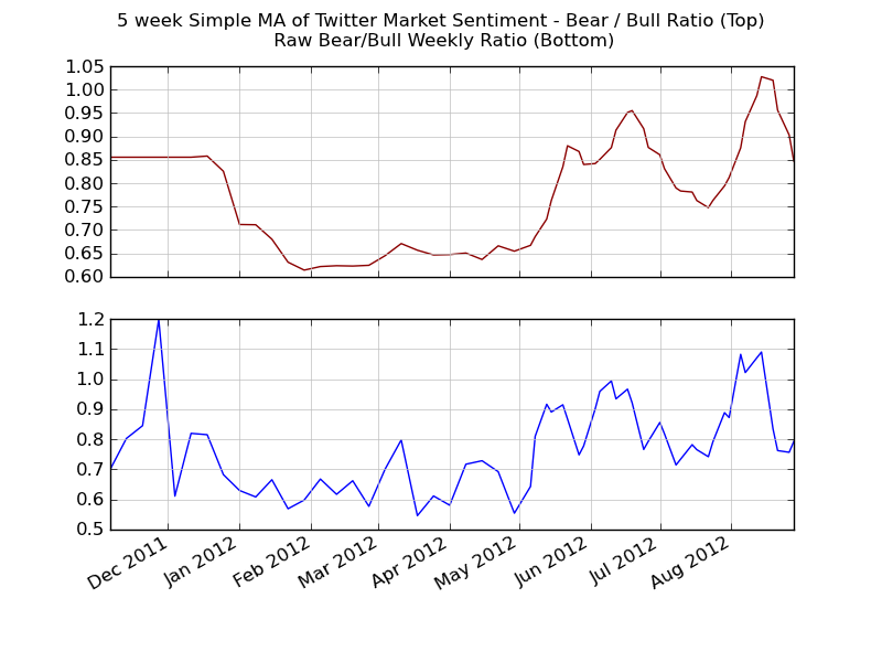
I’ve taken things a step further to look at a longer-term view of twitter sentiment using Weekly Data. For this data, I sum up all data for each week (starting on Monday and ending on Sunday). The Weekly Bear / Bull Ratio is shown in the top graph using a 5 week moving average of the Weekly Bear/Bull Sentiment Ratio. The bottom graph contains the Raw Weekly Bear/Bull Sentiment Ratio data.
 The question is, is the sentiment useful for understanding future market direction…or is it something that is ‘created’ by market movement. That’s part of the research that I’m doing now. I’m working on researching if there is any correlation / causation between twitter sentiment and price movement. My gut tells me that there is correlation and the data points to this…but is twitter sentiment leading or lagging the market? That’s the question (at least on of them that I have).
Is the Twitter Sentiment believable/accurate?
One of the things that has bothered me since day 1 of this research is whether the sentiment found via my twitter collection / analysis engine is ‘accurate’. My analysis is only as accurate as my training data set…and right now, my training dataset shows an accuracy of ~90% using the Python Natural Language Toolkit’s accuracy measures. So..I feel good there.
But…I wanted to look at comparing my Bear / Bull Sentiment Ratio with other sentiment measures to get a feel for how it might measure up.
I had a moment of brilliance yesterday. Well…not really brilliance…more like a random thought. But…who’s to say brilliance isn’t really just randomness in the universe 🙂
I decided to compare twitter sentiment to the American Association of Individual Investors (AAII) Sentiment survey data that they release every week.
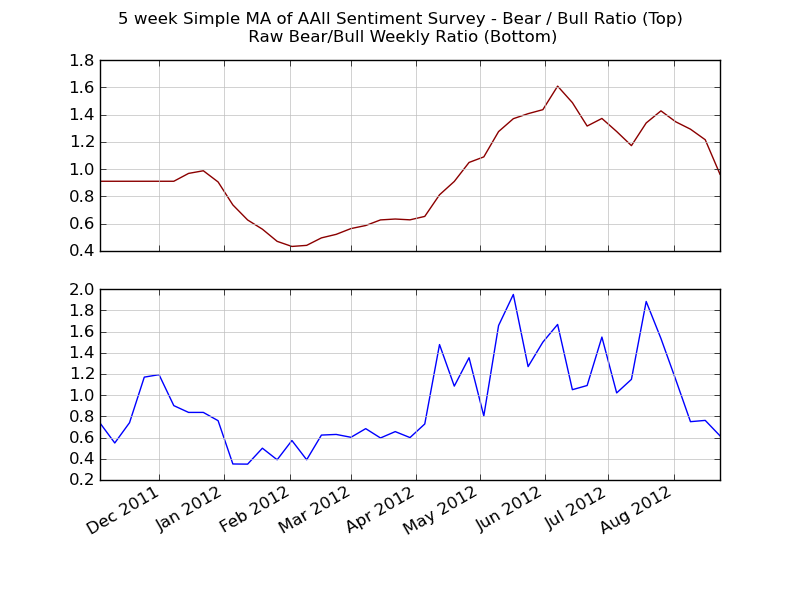
The latest AAII Sentiment Survey is shown below. I’ve taken the data from the latest survey spreadsheet and created a similar ratio to what I am using (I divide the bearish sentiment by the bullish sentiment).
Taking the AAII data and my Weekly Twitter Sentiment Bear/Bull data, I did a quick comparison between the two. While the extremes are different, the data generally follows similar patterns.
Not bad. The levels of the Bear/Bull ratio are different and more pronounced in the AAII survey, but the overall ‘direction’ is similar.
I feel good about this. AAII reaches out to professional money managers for their sentiment survey…I’m watching Twitter to gather sentiment from people who are talking about the market. While the data points are exact matches, the directional bias seems to be close.
Look for more on this in the future.


![Microsoft Excel non-commercial use - sentiment.xls [Compatibility Mode]_2012-08-29_10-01-41](https://www.ericbrown.com/content/images/wordpress/2012/08/Microsoft-Excel-non-commercial-use-sentiment.xls-Compatibility-Mode_2012-08-29_10-01-41.png)

Comments ()