
Finding SPX Support / Resistance Levels from Twitter
This is a cross-post from Trade The Sentiment
In addition to finding sentiment within Twitter messages, there are other data points that can be found in many messages.
One of the key data points is price levels. A good number of people add their thoughts on stops, pivots, support/resistance levels, etc for various instruments on twitter. After reading DownsideHedge.com‘s post on support/resistance levels from Twitter, I took a look at my dataset to see if I could find anything interesting.
I’ve gone through each twitter message I’ve captured (over 2 million of them) and captured each mention of a ‘level’ (support, resistance, etc). I took each of those mentions and stored them off in another database for each symbol segregated by dates (I currently average the data…but am looking at other approaches). With these new data-sets, I can then look at these levels that are shared….and I see some interesting data.
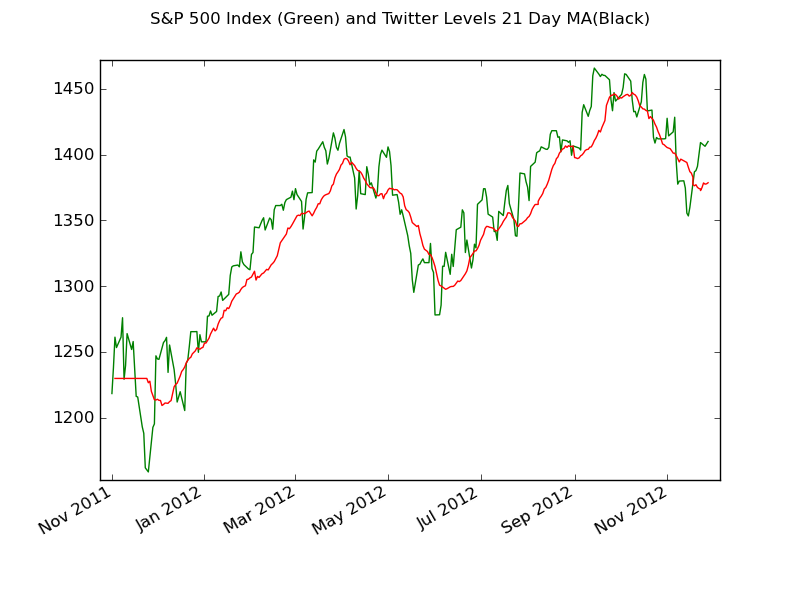
As a test, I grabbed the S&P 500 Index (SPX) levels and plotted them along with the closing price of the SPX….I’ll let you make your own decision on how interesting you think it is…but I’m seeing some statistical significance in the data-sets….the next step is just determining how best to use this data.
For this post, I took the SPX Data from Nov 1 2011 to Nov 28 2012.
Some basic stats for comparison:
- Twitter Levels Median for 21 days: 1381.91 and the mean is 1378.57
- SPX Median for 21 days: 1394.53 and the mean is 1394.75
The first plot is the SPX Close price in Green with the Twitter Level 21 Day Moving Average in Red. As you can see, Twitter Levels do a pretty good job of tracking the SPX.

To smooth out the SPX, I also took a look at plotting the 21 Day Moving Average of the SPX Close shown in Green. I’ve taken the 21 Day Moving Average of the Twitter Levels and plotted them in Red.

This is a cross-post from Trade The Sentiment

Comments ()